Design Problem
I was tasked with crafting a user-centric solution that introduces soft paternalistic interventions within a mobile application. This endeavor revolved around privacy micro-interactions and nudges, aimed at steering users towards more advantageous choices post-agreeing to the application's privacy policy.
My Role in the Project
In the collaborative development of this project, I partnered with another designer, sharing equal roles in ideation, prototyping, and overall app design.
Decision-making, from defining key experiences to detailing privacy features, was a shared process, ensuring a user-centric approach.
Communication and coordination were crucial throughout, with regular check-ins maintaining alignment in our design vision.
While roles were equal, my individual contributions included active engagement in brainstorming and taking a focused lead in specific graphic and user design decisions.
Our collaborative effort aimed to create a mobile app prioritizing privacy, innovation, and an enhanced user experience for travelers seeking connections.

Part 1 - Ideation
Employing the Crazy 8s ideation technique, I sketched 48 draft ideas, exploring the realms of creativity with a deliberate emphasis on quantity over immediate quality. We used other popular dating apps such as hinge and bumble for design reference, and added our own specifications in order to increase privacy and awareness in the application.

Part 2 - Low Fidelity Prototype
Next, we translated these conceptualizations into a low-fidelity storyboard, visually narrating the user's journey through the application. This was an exercise in distillation, focusing on the most critical components of the user experience.


Part 3 - High Fidelity Prototype
This tangible representation of the application's key experiences demands meticulous attention to detail and a seamless user interaction.
Prototype Link: https://www.figma.com/proto/mOLGedGKNOtAmpyFOjyNpF/GBDA-414-Travel-Hook-Up-App?page-id=0%3A1&node-id=147-3332&viewport=1051%2C277%2C0.14&t=LPlPv5nILQeXGXf5-1&scaling=scale-down&content-scaling=fixed&starting-point-node-id=8%3A2339&show-proto-sidebar=1

Part 4 - Design rationale
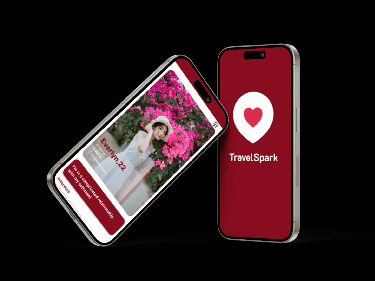
App Overview:
- Travel hook-up app targeting travelers, including returning users.
- System displays travelers globally heading to the same destination or currently in the user's traveled location.
- System displays travelers globally heading to the same destination or currently in the user's traveled location.
Privacy Enhancement:
- Goal is to encourage users to be mindful of shared data, prioritizing privacy.
- Various nudges alert users about sensitive information in chat, providing control over sharing.
- Various nudges alert users about sensitive information in chat, providing control over sharing.
Limited Profile Information:
- Limited information displayed before a match.- After matching, users gain access to more detailed profiles and travel stories.
Controlled Access to Information:
- Enhances privacy by allowing controlled access to personal information.
- Effectiveness and user acceptance ensured through controlled information sharing.
- Effectiveness and user acceptance ensured through controlled information sharing.
Interface and Engagement:
- Replaced SuperLike with "My AI" function for immediate assistance and data understanding.
- Engaging cartoons accompany nudges for user-friendly and recognizable alerts.
- Engaging cartoons accompany nudges for user-friendly and recognizable alerts.
Value Addition:
- Prioritizes privacy and control in travel hook-up context.
- Addresses key concerns and fixes existing issues through innovative features.
- Detects and nudges users about potentially sensitive information, promoting a safer environment.
- Addresses key concerns and fixes existing issues through innovative features.
- Detects and nudges users about potentially sensitive information, promoting a safer environment.
User Education and Assistance:
- My AI feature replaces SuperLike, providing immediate access to data management and privacy information.
- Contributes to a user-friendly experience, distinguishing the app from traditional dating platforms.
- Contributes to a user-friendly experience, distinguishing the app from traditional dating platforms.
Enriched User Interactions:
- Post-match access to additional information, travel stories, and shared globe page.
- Encourages meaningful connections and content sharing, enhancing overall user experience.
- Encourages meaningful connections and content sharing, enhancing overall user experience.
Summary:
- Focus on privacy, control, innovation, and engaging content sharing.
- Aims to create a safer, more controlled, and enjoyable environment for travelers.
- Effectively adds value to the user experience in the travel connections domain.
- Aims to create a safer, more controlled, and enjoyable environment for travelers.
- Effectively adds value to the user experience in the travel connections domain.
Part 5 - Usability Testing
Since I was a student at the time of this project, it was difficult for me to get access to real user groups to test my product on.
I have created the following usability test and user testing data in order to showcase my research process.
Goals of Research
1. Evaluate functionality of the app with a focus on swiping, messaging, and matching.
2. Understand user experience through qualitative testing in the form of tasks and questions.
Participants
- I conducted this research on a group of 15 users aged 20-35. Users were briefed about the purpose of the app and the test parameters beforehand.
Methodologies
1. Think-Aloud Process: Encouraging users to share their unfiltered thoughts as they work through a series of tasks within the app, moderating responses without asking them direct questions that could otherwise sway their feedback.
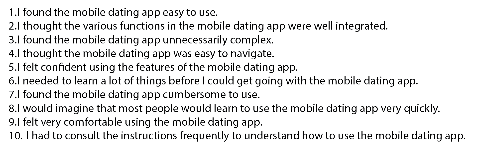
2. System Usability Scale: Surveying customers after they have interacted with the product to get a numerical response between 1-5 based on 10 statements. Survey Questions:
Key Insights
1. Visual Design/Layout
Positive Feedback:
"I love the clean and minimalist design of the app! The use of white space makes everything feel uncluttered and easy to navigate."
"The icons used throughout the app are intuitive and easy to understand. They provide visual cues that help me quickly identify different features."
"I appreciate the consistency in design across all screens. It gives the app a cohesive look and makes it feel polished."
"The typography is elegant and easy to read. It enhances the overall aesthetic of the app."
Negative Feedback:
"I find the color contrast between the text and background to be too low, especially in certain lighting conditions. It makes it difficult to read."
"The layout feels a bit cluttered, especially on the homepage. There's too much information competing for attention, and it's overwhelming."
"Some of the icons are unclear and don't provide enough context. I often find myself tapping on them to figure out what they do."
"The font size used for certain text elements is too small, making it hard to read without zooming in. It would be helpful to have adjustable font sizes."
"I'm not a fan of the design aesthetics; it feels outdated compared to other apps in the same category. A modern refresh would greatly improve the user experience."
2. User Privacy
Positive Feedback:
"I appreciate the robust privacy settings available in the app. It gives me control over what information I share and with whom."
"The app's privacy policy is clear and easy to understand. It reassures me that my personal data is being handled responsibly."
"I'm glad the app regularly updates me on the privacy of my information. It shows a commitment to user privacy and security."
Negative Feedback:
"I'm concerned about the amount of personal data the app collects and how it's being used. It would be helpful to have more transparency around data collection practices."
"The app's default privacy settings are too permissive for my liking. I wish there were more granular controls to customize my privacy preferences."
"I've experienced some privacy-related glitches in the app, such as messages not being properly encrypted or settings not being saved. These issues undermine my confidence in the app's privacy features."
Research Findings & Design Changes
Overall, the app has received positive feedback for its clean and minimalist design, appealing color scheme, consistent layout, and elegant typography. However, there are areas for improvement, particularly regarding color contrast, cluttered layout, unclear icons, and font size. Additionally, while the app has a clear prioritization for user privacy, users have expressed concerns about transparency in data collection practices and privacy-related glitches.
To address the design issues:
Color Contrast: Increase the contrast between text and background to improve readability, especially in different lighting conditions. Choose colors with higher contrast ratios and test them in various environments.
Cluttered Layout: Simplify the homepage by prioritizing key information and reducing visual clutter. Use whitespace effectively to create a more spacious and organized layout. Consider grouping related content and utilizing visual hierarchy to guide users' attention.
Unclear Icons: Redesign unclear icons to provide better visual cues and context. Conduct user testing to ensure that icons are easily recognizable and understood without the need for additional taps.
Font Size: Increase the font size for smaller text elements to enhance readability, especially on smaller screens. Implement adjustable font sizes or provide options for users to customize text size according to their preferences.
Outdated Design Aesthetics: Refresh the design to adopt more modern aesthetics in line with current trends and competitor apps. Update visual elements such as color palette, typography, and iconography while maintaining consistency across the app.
Transparency in Data Collection: Provide more detailed information about the types of data collected, how it's used, and who it's shared with. Enhance transparency through clear explanations and accessible documentation within the app.
Privacy-Related Glitches: Address privacy-related glitches promptly to maintain user trust and confidence. Conduct thorough testing and implement robust encryption measures to ensure the security and integrity of user data.
Part 6 - Conclusion
This design problem was an opportunity to architect a digital experience that not only meets privacy standards but elevates user empowerment, understanding, and engagement.
This project allowed me to dive deep into UX and UI practices, and conduct user-testing as I would in a business development role.